Have you ever walked into a room or scrolled through pinterest and had one of those moments where you are looking at a space filled with all different patterns that just perfectly work together? Then comes the thought of "how did they do that?!".
Don't worry I have totally been there too (and still frequently am). Some designers (and home dwellers) are just down right amazing at mixing prints. It can seem like a tricky thing to master, but honestly there are just a few key components you have to remember to make your space look like a professional was there.
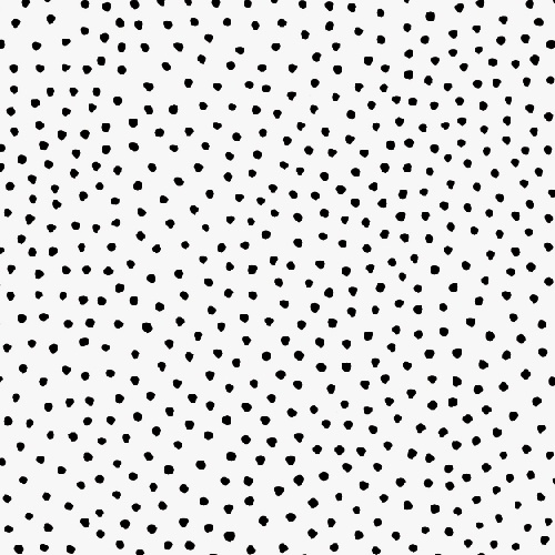
Two busy patterns will turn your interior into a serious eye sore.
Instead, try matching up this organic vibrant pattern with a neutral geometric one. This will leave your room looking sophisticated, yet fun.
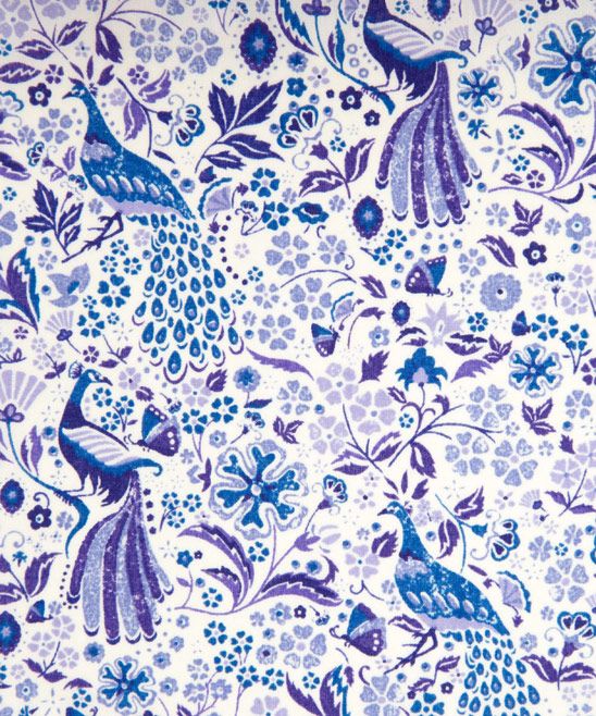
A small pattern + a small pattern confuses all onlookers. It makes it look like you couldn't decide which to use so you just threw both in.
Try mixing a small pattern with a large pattern to leave your room looking dynamic. In this case it also brings some color into the space without overwhelming the room.
Two patterns of the same(ish) animal, people might think you have a slight obsession.
Instead, try mixing this fun fox with a complimentary color Ikat to add the perfect balance between ferocious & fun.
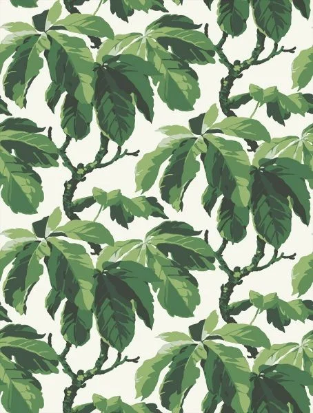
Unless your space is on a tropical island or a beach house along the coast, mixing floral on floral is a bit overwhelming.
(To be honest, this combo at a beach house might even be to overwhelming)
Try a to mix those same green vines with a small scale pattern with lots of great color to pull from. The greens in the pattern on the right really pop when paired with the print on the left.
All and all, just have fun with your space. Sure these key rules are helpful in making your space as amazing as possible, but to be honest, just have fun with it. If you love something, buy it. If you love it enough you will make it work no matter what. Enjoy // Like // &Share


